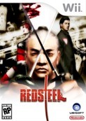
Interview: Red Steel's Stephane Bachelet

Posted 23 Aug 2006 at 15:57 by Tom Phillips
How will Red Steel look? Questions answered inside by the graphical director of Ubisoft's hot Wii exclusive.
 Hi, can you please introduce yourself?
Hello, I'm Stephane Bachelet, Artistic Director for the Red Steel project at Ubisoft.
Where are you with Red Steel graphically speaking?
In terms of graphics, we proceed step by step for Red Steel: First of all, it took a few months before we decided to use Japan as the main setting. So during this period, we made research on different ideas and locations and the style that could be interesting to highlight it. As we did not have any technical info at this time, it was a very open minded period: any idea could be the good one. Then, once we decided to have the game in Japan, we started working on style and graphic intentions. Concerning the game graphic style, we again made tons of researches. We had a clear idea of what we wanted to do. How can we do it was much more challenging indeed. The console was in development, so we worked on Nintendo GameCube kits and PC and made projections based on the technical specs we started receiving. The Wii kits actually arrived 1 month prior E3. The E3 demo had to be delivered so quick that we could not take time to implement the whole graphic chart we developed. So, E3 version graphics were Work In Progress, just to be showable, not finished. We wanted to take time to see people play for the first time with our game, help them to handle the Wii remote and finally, let the door open to all useful changes that would be necessary for the gameplay. Now we work on developing our complete style specific to Red Steel that will not only be a great support to the scenario & the gameplay but also be the visual identity & signature for this new brand. We keep working a lot on the impact of the graphics on the way the player plays as well.
Do you feel limited vs. the power of the console?
The relative power of the console set a limit in fact. That is why we started working on a stylish realistic rendering rather than on a pure photorealism treatment, with shaders and other heavy SFX. The idea is to provide eye catching scenes that are really cool and emphasize the action of the game, rather than places that highlights impressive SFX you do not pay attention in the middle of the action anyway.
The game happens in Japan, but Japan was not our only source of inspiration. In contrary, we wanted to focus on the experience of a US man in a foreign country and on the cultural choc of all the differences that can jump to his eyes. It was key for us to keep an occidental look. When a westerner goes to Japan, the most striking element is that there are tons of colours everywhere. A typical street of Japan is full of advertisings, flags, neons. It is the same thing, if you look at a magazine or inside a shop. For us, it was not interesting to render this heavy coloured style as it would have been difficult for the player to identify rapidly enemies in a multicoloured background. Therefore, we took inspiration into a completely different style where flashy colours are there but not everywhere: 70's "films noirs" such as Straw dogs. It was interesting for us as it is a very edgy dark atmosphere with tons of attitudes and colours: a perfect inspiration for us. Moreover such references work perfectly with gangsters and mafia. We just adapted it to Japan and yakuzas. Unfortunately, we did not have enough time to implement it into the E3 version.
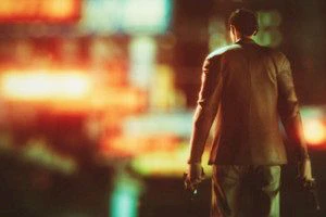
In concrete terms, how will it look like?To give the darker ambiance we use a lot a "desaturation" treatment above this look. By desaturation, I mean we low down all the colours and have more coloured grey in the end than real colours. In parallel, we also push the lighting system. We implement tons of flashy colourful neons, lights and objects. Sometimes, they even are blurred sources of lights, which shine with bloom within the grey atmosphere. In addition, we contrast a lot the graphics: lights are more powerful, shadows are darker. In the end, the goal is to look old but not black & white, and flashy colours vehicle a touch of modernism. We support a lot the "films noirs" side of the game but we adapt it our way. Note that these contrasts between shadows and colours should also help the player to progress / to be guided through the levels. In the same idea, characters will be less desaturated in order to be more visible for more comfort.
How do you recognize Japan in the game?
You will recognize Japan because you're an occidental person and this game is designed as Japan being seen by occidental people. So we use the typical stereotypes: geisha, ideograms, paper rice� We made two trips in Japan to make pictures & notes. We are Japanese as much as we can but seen by our occidental emotions and vision. At the end it is like the Kill Bill vol. 1 movie. It is a high concentration of stereotypes about Japan that are used in a very exciting way for a westerner audience.
It seems that you also work a lot on oppositions, can you explain more?
Sure! The "oppositions" are something we worked on at all levels for the development of Red Steel. This is the heart of the game. Because it is cool but also really faithful to Japan & the game concept. For instance, the story of a US guy who discover a new Asiatic culture or the mix of modernity & traditions present everywhere in Japan. For all westerner, Japan is the country where you have ancestral traditions and looks (Geishas, kimonos, ninjas�) and at a same level, top notch technology with all the electronic devices you can find in Japan. At a graphic level, it gives us the opportunity to build the maps around this contrast. This can be illustrated with a Dojo lost in the middle of modern buildings. This is a willing from the dev team to have those recurrences in the game.
What did you like the most creating or "recreating" for the game?
It was very fun to work on the Geisha pleasure level with small both traditional & modern streets. The traditional side of Japan is really interesting to develop such as the bamboo forest. In terms of characters, all of them were fun to develop but the fisher men and the characters from the Gun Fighting map that we will unveil later, were the funniest to create. Of course, Mama San was also very cool to create & design.
What is the link between the game style vs. the story vs. the atmosphere?
All points influence & complete all points. The game is all about style and edginess. This is rendered by this specific eye catching style, the exotic locations and the fascinating underworld of yakuzas. Everything goes together to build a really cool and exciting experience.


